Background
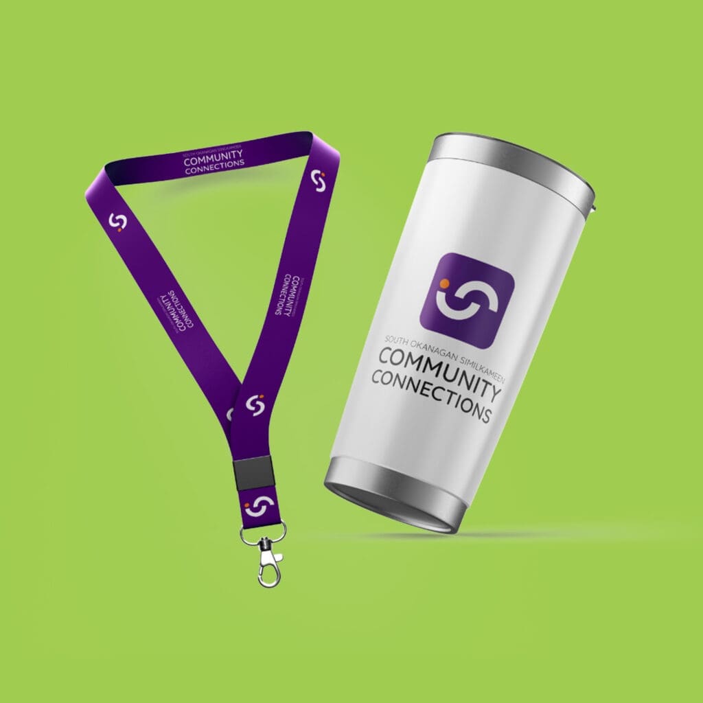
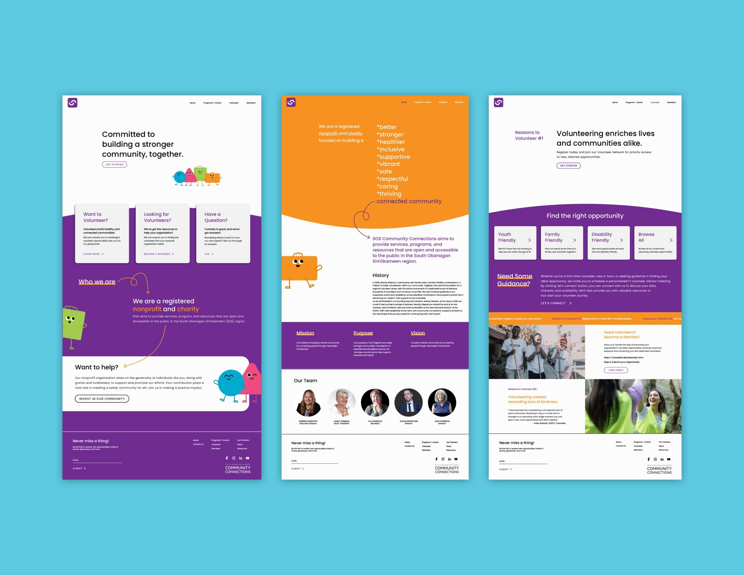
SOS Community Connections (formally known as SOS Volunteer Centre) approached us and wanted a full rebrand and website. They wanted a name change as well since they were beginning to expand their services.
Challenge
SOS Community Connections has many volunteering opportunities. They wanted to narrow down their brand messaging and create a brand that encapsulates all their services.
Target Audience
They appeal to a wide range of people who want to give back to their community. Here are some of the basic demographics: age: 15-70, location: Penticton, BC, gender: male and female, income: all ranges


